Here I have inserted both my preliminary task, and my full opening sequence.
Brógan Gallagher- AS Media Coursework Portfolio
28/03/2013
Evaluation Question 7...
Looking back at your preliminary task, what do you feel you have learnt in the progression from it to the full product?
By having the two clips side by side, you can easily see the difference between the two.
One thing I learnt from my preliminary task is that we need to check locations very carefully, mainly to avoid distracting things in the background. For example, at 0:06 in the preliminary task, a computer screen is in shot, displaying a desktop background of Stone Henge. It was only when watching the footage during editing did we notice how eye catching that screen is. If we noticed it, then any audience member is bound to notice it and be distracted from the action in the clip.
Another occurance of this is at 0:15 where a rucksack can be seen on the floor behind the girl in the green coat. When the camera next cuts back to this girl at 0:20, the bag is no longer in shot, making it very obvious that the camera was moved between shots. This is emphasised by the fact that the girl in the purple shirt is more visible in the second shot.
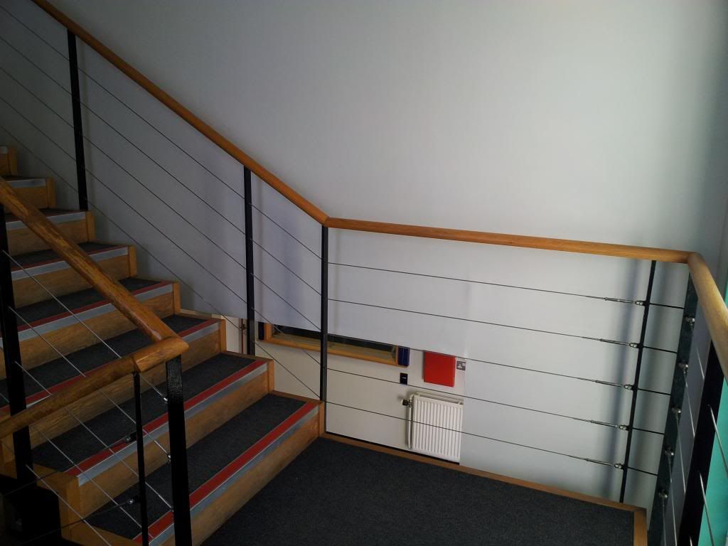
We did take this very much into account during the filming of our final product, but during this evaluation I noticed one slight incident of a changing background between shots. between 1:14 and 1:18 on our final product, in the lower right hand side of the screen, a person can be seen entering the building through a gap in the staircase. Although it is hardly noticeable unless you pay close attention, it is still a very school boy error that the cinematographer should have been aware of.
At 0:16 in our main task, the background shows fire extinguishers and emergency signs. In this case, that was intentionally placed in the background as a subliminal message. Fire extinguishers and evacuations are things often linked with danger. By placing them slightly in view as we look at the female character, it hints that there may in fact be something dangerous about her that we should be aware of.
Another thing learnt from the preliminary task is the importance of match-on-action shots to make the clip easy for the audience to follow. This can be seen between 0:03 and 0:06 in the preliminary task, where we see the girl in the green coat walk TOWARDS a door in the first shot, and in the next shot we see her walking THROUGH a door. This simple trick means that the audience is aware that this is the same door at the same time. You can see this influence in our main task between 1:10 and 1:19. In the first shot, from a high angled shot we see a girl walking up a flight of stairs looking at the ground. In the next shot, we see what appears to be a point of view shot, which shows the same walking movement at the same place the girl had been walking. This shows to the audience that the point of view we are seeing is that of the girl on the staircase.
The dialogue in the preliminary task had not been formally scripted, but we had discussed what would be said beforehand. The main issue with this was that editing was difficult as the actors said different variations of their lines each time- meaning that sometimes the conversation might not make sense when edited together.
There was no dialogue included in our main task as we didn't feel it was necessary, but had it been used, as producer I would have ensured lines were formally planned and scripted to make sure they made perfect sense in the final edit.
One of the main influences that I took from the preliminary task was that we should use as few straight cuts as possible. I feel that a plain simple cut used for EVERY transition makes the clip dull to watch, and also gives it an amateur feel.
In some cases rapid cuts between clips can be effective, and they are often used to show tension.
I can see hints of this within our final product, especially between 0:12 and 0:16, where we used jump cuts to show rapid movement. The movement expressed is actually so fast that it appears unnatural, which helps to build the ambient theme of our clip, which is in the horror genre.
Overall, I think I gained a lot of knowledge from creating the preliminary task, and by applying this to my final product, I feel my opening sequence is very effective and very enjoyable to watch.
26/03/2013
Final Product- Edited...
This is the final version of our opening sequence. The most obvious editing issues have been corrected, and the title of the film has now been included as well.
25/03/2013
Evaluation Question 3...
What kind of media institution would distribute my media product and why?
examples of some institutions that could distribute my product:
Fangoria- horror themed magazine
Fangoria is a well known publisher in the USA. this institution might distribute my product as it specialises in everything horror themed. It has a weekly magazine, and a website where it posts videos, but also has links with many movie festivals across the USA which would allow us to get our product out to a wider spread of people and increase our target audience. I think they would distribute my work as it fits nicely into the 'Horror' category.
Independent Cinema Office
The national organisation for the development and support of independent film exhibition in the UK. They aim bring a wider range of films to a wider range of audiences. This would be an effective institution to distribute my product as it would help to reach an audience right across the UK whereas most independent cinemas have a niche audience.
A local independent cinema that specialises in evening showings of independent films at a very reasonable £4 a ticket. This pricing means that people would be more willing to spend the money to watch a film they may be a bit wary of, because it is cheaper than a regular cinema. The only downside is that they only have one branch of cinema and not much advertising so appeals to only a small target audience.
Youtube
Although Youtube are not primarily 'distributors' as such, this would be a very useful platform in order to help us get our product to a wider audience. Youtube is a free video sharing website that is readily available in almost all countries. It allows you to add 'keywords' to your video, meaning that when that word is searched, your video will become a suggestion. This would be effective to help broaden the audience of our product as people may find it accidentally but then advertise it by word of mouth to their friends.
Film 4
film 4 is a subsiduary company of TV broadcaster Channel 4, and it focuses solely on showing British made Independant films. It is currently a terrestrial channel meaning anything shown on it will be shown to an extremely large and diverse audience, which is exactly what our product needs.
the main type of institution that would distribute my product would be independent cinemas. the purpose of those are to take small films and provide them to their target audience, however small the audience may be. These independent cinemas are very helpful when starting out in the film industry as they are relatively inexpensive, leaving you money to create flyers/advertisements etc. to spread the word about your screenings.
Evaluation Question 2...
How does your media product represent particular social
groups?
Gender is not very well represented as only female
characters are ever seen on screen. However, there are many obvious contrasts
between the two main female characters. One appears proper and civilised, with
a high paid office job. She is also the taller of the two women so you would
assume she is the most powerful.
The other female character is short and at a quick glance
could be mistaken for a child. However, both characters are in their late 20’s.
The shorter character should be the least powerful of the duo, but
throughout the product we see that actually, she may have the upper hand. This
could be due to the fact that they are of similar age yet behave in such
different ways. One just ‘gets on’ with her 9-5 office job, passing the hours
of her monotonous life, whilst the other is spending every waking second
meticulously plotting and scheming, breaking laws and living on the edge.
Personally I feel that the ‘villain’ has reached more of her potential in life,
regardless of whether it was for good or evil.
Typically in media, characters of ethnic minority (mainly
Black people) are perceived as the criminals. In our media product this is
reversed, as the black character has the successful well-paid job, whilst the
white character is the one breaking the law.
This helps to represent black
people in a positive light.
There is no real representation of class within my product
as there is nothing within the clip that could indicate the social class of
either character. For all we know our ‘villain’ could have come from an upper
class family who disowned her because she was mentally ill, or she could have
been an orphan who spent her childhood tossed from home to home, forced to live
with other people’s parents.
There are no hints towards the sexuality of either
character throughout the product, although we could infer that it is very
unusual for a woman to follow another woman- maybe there is an underlying issue
there, which would be revealed later on in the clip. It could be that the
villain is a lesbian, secretly in love with the office worker, or it might be that
one woman stole another’s boyfriend, or had an affair with another’s husband. There
are many different ways that sexuality could be represented within the clip.
First Cut Of Our Opening Sequence...
19/03/2013
Creating Our Props...
we had to spend some time as a group creating props to use as they were not readily available for use. this included formatting our own 'medical records' which needed to be filled out in complete detail as the text would be readable on camera.
we also had to find some odd coloured pills in order for them to stand out as they spilled across the table. in the end we decided to purchase some fish oil capsules as they had an unusual shape and colour.
we also had to find some odd coloured pills in order for them to stand out as they spilled across the table. in the end we decided to purchase some fish oil capsules as they had an unusual shape and colour.
Credits...
we decided to try and find an interesting way to display our credits throughout the opening sequence, and after group discussions we decided that we should incorporate the credits into the footage, rather than edit them in afterwards.
with this idea in mind, we considered ways to show the credits whilst still fitting the theme of the clip.
eventually we concluded that we should have a printer printing out the credits, as this incorporates the institution/office setting of our clip.
to do this we created a list of names that needed to be included, set them up on a word document, positioned a camera at a bird's eye view angle facing the printer, and hit print.
Shot Types...
15/03/2013
Filming...
our first session of filming was quite sucessfull, we managed to get all the shots we had hoped to get. we also got some interesting shots that we only realised were possible once we'd started filming, for example- whilst shooting our actor walking up the staircase, from where i was stood i spotted an interesting shot using the refection of the actor in the window. I think the shots we found spontaneously will add to the overall product.
we also had a few difficulties whilst filming, mainly caused by the fact that our location was a public place that people often had to walk through, meaning a lot of shots took 4 or 5 attempts to get right.
we also had a few difficulties whilst filming, mainly caused by the fact that our location was a public place that people often had to walk through, meaning a lot of shots took 4 or 5 attempts to get right.
12/03/2013
Editing- first stage...
08/03/2013
Creating the Title Animation...
(created by Bradley)
I produced our company logo/name animation for the beginning of our opening sequence in conjunction with a friend of mine. we both advised each other on improving our groups original design ideas and helped each other out with operating the design software(adobe after effects), this is what me and my friend produced:
We used a simple design of text for our production company name(ChairEdge studios) which is in viner hand font and a maroon colour.
The text is an overlay ontop of what appears to be a layer of glass that has been misted over, with the vague image of a bloody hand coming through the misted glass, this effect was achieved by creating a light blue colour layer with a light placed appropriately behind it, to which another darker layer was placed behind with the bloody handprint on top.
the text(our production name) is placed on glass, which appears to be smashed by our production logo(the 6 fingered bloody hand) which is both original but yet intriguing as the hand has 6 fingers on it, something which only eagle eyed audience members will spot. This idea is an original one and is a conventional feature of most horror films of this type.
The smashing of the glass and therefore our production name, makes the transition into the next clip/sequence of the opening sequence very easy to create and perfect into a flowing motion because the smashing of glass will slow down, and create a nice ending to this part of the sequence, the transition will be achieved by either a fade out from the smashing to a black credit or an actual filmed clip, depending on which looks better in the edit stage(something to be discussed in one of our group meetings).
05/03/2013
Title Ideas...
the idea for our production logo is going to be something along the lines of a 6 fingered bloody hand appearing on the screen from far away, to eventually come forward and hit some glass at the front of the screen. this will have our company name "ChairEdge Studios" displayed across it. This glass then cracks and smashes when hit by the bloody hand, causing the glass and company name 'fall off' of the screen towards the bottom.
here is the bloody hand image I propose to use:
here is the bloody hand image I propose to use:
the idea of using a 6 fingered hand is to instantly give the idea that something unusual is occuring. At first glance the hand looks like a regular hand, its only on closer inspection that you realise the extra digit. this idea of unusual and abnormal will instantly set the tone of the film, along with the animations used on it.
We decided on the logo as a whole group, but left the final presentation of the sequence to the editor, Bradley
We decided on the logo as a whole group, but left the final presentation of the sequence to the editor, Bradley
01/03/2013
Treatment...
Written by the Producer, Brogan.
Our idea:
Our idea:
- Opening shot shows a long dark corridor (XLS)
- Camera zooms forwards towards the end of the corridor twice
- Extreme close up of actor's face- very quick cut
- a piece of plain paper comes out of a printer- credits will be edited to look like they are on the paper (close up)
- Camera pans from right to left- shows a woman operating a photocopier in a small room with a large glass window to her left (through which a staircase can be seen) (medium long shot)
- a piece of plain paper comes out of a printer- credits will be edited to look like they are on the paper (close up)
- female character walks down an alleyway, to the right is an opening in which we (the audience) see a glimpse of the horror character (medium shot) [possibly lots of rapid cuts]
- close up of a set of records being thrown down onto a table- a sheet of paper slides out to show a "mental health assessment" record of some sort. (possibly in slow motion)
- POV shot of someone walking up the stairs- appears unsteady on their feet (medium shot)
- a piece of plain paper comes out of a printer- credits will be edited to look like they are on the paper (close up)
- extreme close up shot of the medical records showing the patient name and showing that they are in fact mental assessment records
- high angle shot (CCTV like) showing an empty staircase
- (slow motion?) close up shot of a bottle of pills dropping and spilling out.
- POV shot of someone walking up the stairs- appears unsteady on their feet (medium shot)
- a piece of plain paper comes out of a printer- credits will be edited to look like they are on the paper (close up)
- pan down of the medical records to slowly reveal the writing on it (Extreme close up)
- repeat of CCTV shot except this time a person is stood on the corner of the staircase
- a piece of plain paper comes out of a printer- credits will be edited to look like they are on the paper (close up)
- medium long shot of the photocopier room (focusing on the window)
- POV shot of someone walking up the stairs- appears unsteady on their feet (more so than in the first shot) (medium shot)
- a piece of plain paper comes out of a printer- credits will be edited to look like they are on the paper (close up)
- medium long shot of Photocopier room window- you can slightly see the head of the horror character peering through the window. (start of a progressive sequence)
- extreme close up of medical records- panning down to start to reveal a picture of a face (progressive sequence)
- medium long shot of Photocopier room window- you can see more of the head of the horror character peering through the window. (progressive sequence)
- extreme close up of medical records- panning down to continue to reveal a picture of a face (progressive sequence)
- medium long shot of Photocopier room window- you can now see all of the head of the horror character peering through the window. (progressive sequence)
- extreme close up of medical records- panning down to fully reveal a picture of a face ( final shot of progressive sequence) this shot will confirm to the audience that the character outside the photocopier room is the same person who's medical records have been read.
- extreme close up of horror character's face (quick cut to increase effect)
- extreme quick cut of pills bottle spilling
Inspirations...
with most of the preparation work now complete, we decided to look at our inspirations for our work, and consider how they will influence our final project.
the main character of Orphan provided inspiration for what our main character should look like

Nightmare on Elm Street inspired the theme of 'stalking' of an innocent looking character, by the 'horror' character.
the setting of this film inspired us to use an instituion of some sort as our location- it means that the audience is left to question the mentality of the characters.

again, this was inspiration as to the way the characters will act.
Soundtrack...
this is the soundtrack we are planning to use. Bradley found this on a royalty
free website and it fits our opening sequence plan perfectly.
the mood the soundtrack provides is perfect for our intentions, it is very well
timed to our shots and is a good all rounder for fulfilling our needs.
Storyboard...
This is our storyboard , Firstly we discussed the sequencing as a whole group and decided what each box would contain, then the drawings were done by me (Rachael), and the captions by Bradley.
25/02/2013
15/02/2013
Locations...
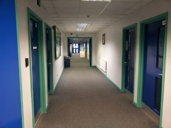
this is the corridoor that will be shot in reverse order to what this image displays, this is where the 3 jump/speed cuts will take place to show the photocopier room and the evil character.
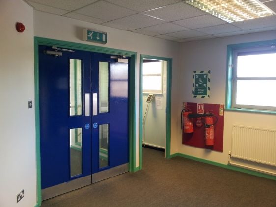
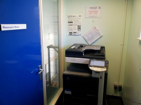
this pictures shows the view after the jump/speed cuts have occurred, of the photocopier room and the end of the corridoor, which are both used for the rest of the opening sequence.
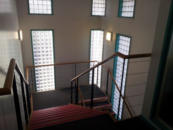
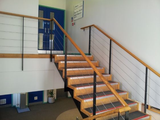
this picture shows the stair way that we intend to also film on, this is where we feel the security camera effect should be placed on the opening sequence as it is unique but original in that this effect has been used of other films in our genre style of films before, but not in the way we intend to use it.
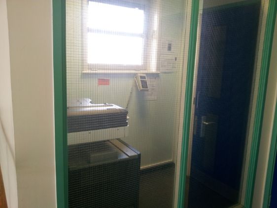
this shot is the view from the photocopier room of which we intend to show the evil crazy character appearing at the bottom of the stairs in the shot, and appearing from the side.
this shot is the reverse shot view from the photocopier room of which we intend to show the evil crazy character appearing at the bottom of the stairs in the shot, and appearing from the side.
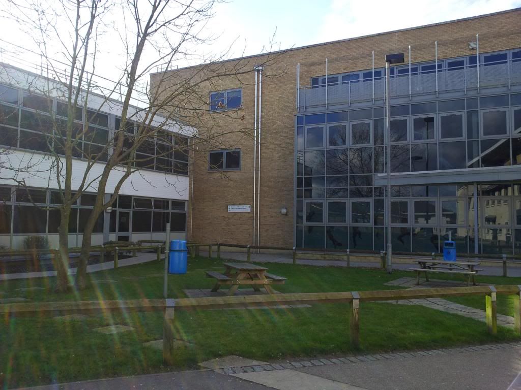
these are some possible shots of a possible location for filming to give a feel and establishing shot of where the action is happening.
Locations were scouted by the Editor, Bradley.
13/02/2013
Costumes and props planning...
for Lauren - hospital gown of some sort, possibly dirty/ripped.
white socks, shoes optional?
make up should make the actor look pale and tired, with dark bags under their eyes
for Office Worker- office attire; e.g. pencil skirt, tights, flat shoes, white blouse and jacket. hair up in a tight bun. glasses possibly (although, watch for reflections in the lenses)
props will include:
a photocopier (can be found on location)
a set of medical records (can be made or copied)
a bottle of pills (found at home/bought) [no pills taken]
actors and props were located by the Producer and the Cinematographer
08/02/2013
Generic Conventions...
For this project, we're trying to avoid the major clichés of horror films, although some are effective in creating the fear we want in our audience.
As the producer i thought it would be helpful if we started by looking at the different subgenres of horror, and the different features that define each one:
- Action Horror - A subgenre combining the intrusion of an evil force, event, or supernatural personage of horror movies with the gunfights and frenetic chases of the action genre. Themes or elements often prevalent in typical action-horror films include gore, demons, vicious animals,vampires and, most commonly, zombies. This category also fuses the fantasy genre.
- Body horror – In which the horror is principally derived from the graphic destruction or degeneration of the body. Other types of body horror include unnatural movements, or the anatomically incorrect placement of limbs to create 'monsters' out of human body parts.
- Comedy horror – Combines the elements of comedy and horror fiction. The comedy horror genre almost always inevitably crosses over with the black comedy genre.
- Gothic horror – Gothic horror is a type of story that contains elements of goth and horror. At times it may have romance that unfolds in the setting of a horror tale, usually suspenseful. Some of the earliest horror movies were of this sub-genre. Examples include universal horror films such as The Phantom of the Opera, Dracula, Frankenstein and The Mummy.
- Natural horror – A sub-genre of horror films "featuring nature running amok in the form of mutated beasts, carnivorous insects, and normally harmless animals or plants turned into cold-blooded killers." This genre may sometimes overlap with the science fiction and action/adventure genre.
- Psychological horror – Relies on characters' fears, guilt, beliefs, eerie sound effects, relevant music, emotional instability and at times, the supernatural and ghosts, to build tension and further the plot.
- Science Fiction horror – Often revolves around subjects that include but are not limited to killer aliens, mad scientists, and/or experiments gone wrong.
- Slasher film – Often revolves around a psychopathic killer stalking and killing a sequence of victims in a graphically violent manner, mainly with a cutting tool such as a knife or axe. Slasher films may at times overlap with the crime, mystery and thriller genre, and they are not all of the horror genre.
- Splatter film – These films deliberately focus on graphic portrayals of gore and graphic violence. Through the use of special effects and excessive blood and guts, they tend to display an overt interest in the vulnerability of the human body and the theatricality of its mutilation. Not all splatter films are slashers, and not all splatter films are horrors.
- Zombie film – Zombie films feature creatures who are usually portrayed as either reanimated corpses or mindless human beings. Distinct sub-genres have evolved, such as the "zombie comedy" or the "zombie apocalypse".
The typical 'scary' character of any horror film will often be masked or disguised in some way, adding to the mystery and the fear of this character.
The 'victim' in this genre will usually be a female, who appears very meek and innocent, but often ends up being braver and stronger than the audience could ever imagine.
we're going to try and use these typical characters within our work so that the audience will easily be able to identify each character and will understand who they should fear and who they should fear for.
Group Meeting; Production company name & logo...
Today we met as a group to discuss ideas for the name of our production company, and also to start to create a logo.
For the name, we started by looking at some existing production companies that specialise in horror, such as Twisted Pictures and Hammer Horror Films. We decided that we wanted our company name to reflect the genre of our title sequence, and so we started brainstorming words we thought represented our idea, we also experimented with whether our name should include '___ Studios' or '___ Films'
we collated our ideas and created a shortlist of possible names:
- Alucard Studios
- Phantom Films
- Skull Spoke Productions
- Enigma Films
- Chairedge Films
we then each took it in turns to rate each idea out of three, and totalled the scores. It then concluded that the name of our production company would be Chairedge Films.
As for the logo, we've currently decided on the idea of a bloody handprint, which, on closer inspection, has one extra finger, we created a rough draft of this idea to see how effective it looked:
we also decided to be creative with the name of our film, and decided to mix two words together. Eventually we decided that we should combine 'insane' and 'asylum' to create Insylum. although we haven't decided how this will look on screen yet.
05/02/2013
Roles & Responsibilities...
in order to complete all the tasks in good time, it is necessary to share out the tasks between group members. This is a breakdown of who's doing what:
Producer/Director- Myself
Roles: Costumes and Props
Production Schedule
Treatment
Cinematographer- Rachael
Roles: Storyboard
scripting
Editor- Bradley
Roles: Shot list
Location Recee
Editing
Producer/Director- Myself
Roles: Costumes and Props
Production Schedule
Treatment
Cinematographer- Rachael
Roles: Storyboard
scripting
Editor- Bradley
Roles: Shot list
Location Recee
Editing
25/01/2013
Audience Research...
This is what i hope to find out from my audience research:
-The demographics of the audience (who they are)
-what types of media do they currently enjoy (films, video games, music etc.)
-why they enjoy those types of media
-what they think of my idea
then, i will use the findings from this to influence my work in order to best cater to my audience's needs.
questions that will be asked:
-age?
-favourite genre and why?
-favourite/most memorable title sequence and why?
-what would you like to see from our title sequence?
-what do you think of our title sequence idea?
the results from our research:
audience research was filmed by Rachael, editing by Bradley, and questions written by Brogan.
22/01/2013
Opening Sequence Analysis- Final Destination 4...
0:01- Film title , "The Final Destination." quick zoom into white block font, surrounded by dark red blood splashing forwards. The blood hints towards the gory themes of the film.
0:03- Zoom in 'through' the text- as if it's coming at you through the screen (the film was shown in 3D)
0:06- Name, 'Bobby Campo' appears next to an xray image of a scene from one of the prior films. the text is a simple block font in white.
0:12- The next name, 'Shantel VanSanten' appears in the same block text, next to another xray image.
0:15- 'Krista Allen' appears in the same text, but appears smaller and less noticeable as the screen around it is busier this time.
0:22- 'And Mykelti Williamson' appears in a smaller font, surronded by and xray image of various car parts. we can assume these are the names of the main actors as they dont appear alongside any significant 'job title'
0:26- From this point, the names start appearing in pairs, this time showing 'Nick Zano' and 'Haley Webb'. These names probably represent less significant cast members, as they are given less importance in the shot.
0:32- This time the names 'Andrew Fiscella' and 'Justin Welborn' appear in black instead of white, but still in the same font.
0:35- At this point we start to see the names of crew members along with their job title, starting with "casting by David H. Rapaport and Lindsey Hayes Kroeger"
0:38- "Costume designer: Claire Breaux"
0:40- "Associate Producer: Tawny Ellis-Lehman"
0:43- "Visual Effects Supervisor: Erik Henry"
0:48- "Music by Brian Tyler"
0:51- "Music Supervisor: Dana Sano"
0:55- "Co-producer: Art Schaefer"
0:59- " Edited by Mark Stevens"
1:02- " Production Designer: Jaymes Hinkle"
1:05- "Director of Photography: Glen MacPherson"
1:10- "Executive Producers: Richard Brener, Walter Hamada, Sheila Hanahan Taylor"
1:16- "Produced by Craig Perry, Warren Zide"
1:19- "Written by Eric Bress"
1:25- "Directed by David R. Ellis"
Each piece of text is either brought onto the screen or removed from it by the occuring animation on screen. for example, at 1:02 Jaymes Hinkle's name is removed from the screen by being smashed by a collision with a train. the graphic images on screen coupled by the bold text and fast paced, heavy sounding music, set the scene of a quite intense and gory film.
17/01/2013
Opening Sequence Analysis- The Shining...
the opening sequence I chose to analyse first, The Shining, is a classic film from the 1980's and sits somewhere in the psychological horror/thriller genre.
Watching the clip without sound, the on screen footage appears calm and serine, and we have no reason to assume that anything unusual might happen on this road. The darker themes are revealed by the dark, eerie score used.
We see a car being driven along a long, isolated road, and we are instantly questioning where this car might be heading, and why. As the car drives further along the road the intensity of the music seems to increase, possibly expressing the troubles this person is driving towards.
One noticeable piece of mise-en-scene within this clip is the apparent changing of season as the car drives along. The beginning of the clip appears warm and summery, whereas by the end of the clip, the car is driving alongside a snow covered mountain. We assume this is because he is driving further up the mountain, but it also could represent the fact that our character in the car has been travelling for a long time.
I feel this is an effective title sequence as it draws the audience's attention in. Everyone is a little bit nosey and we will all be curious to see where this road ends, hence enticing viewers to continue watching.
16/01/2013
Preliminary Task - Brogan, Bradley & Rachael...
the preliminary task was to make a short clip, showing a person enter a room, and have a conversation with another person. the clip had to show specific features including: match-on-action shots, shot reverse shots, a variety of shot lengths, and also it had to observe the 180 Degree rule. this clip involved myself, Rachael, and Bradley as the cameraman.
15/01/2013
Coursework Introduction...
Here is the coursework introduction as provided by my class tutor. By referring back to this during the course of my work I hope to stick to the brief well, thus increasing my chance of a higher grade.
"For your coursework you must produce the first two minutes of a film including titles. You also have to produce a 'preliminary task' of shooting a brief conversation to include the 180 degree rule, a match on action edit and a shot-reverse shot.... the preliminary task isn't marked, but it has to be included or you will lose marks.
The opening sequence can be in any genre... but it must be a specific genre.
You can go over two minutes but only by a few seconds.
You cannot use copyrighted music in it - so no recognisable tracks.
Your research must inform your production."
Starting The Project...
this is the first piece of work on planning and research for my coursework.
My group have decided that the genre of our title sequence should be horror. It was felt that in this genre, we would be most able to be creative and experimental with our ideas and techniques.
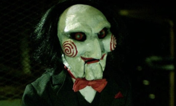
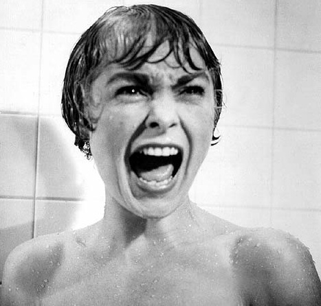
as you can see from these examples, even the movie posters are eccentric and creative, more so than any other genre.
we have also decided on our roles within the project, which was decided by a group discussion. I was given the role of producer, as the group felt I was the one to help keep things organised and under control. It also this enables me to actively input my creative ideas into the final product. Rachael took on the task of cinematographer whilst Bradley became our editor.
Subscribe to:
Posts (Atom)






.jpg)


